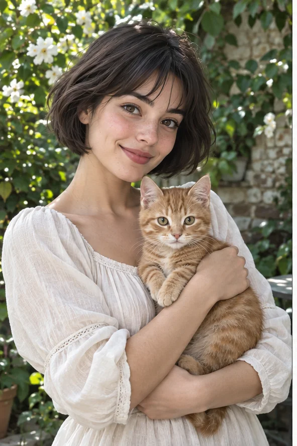
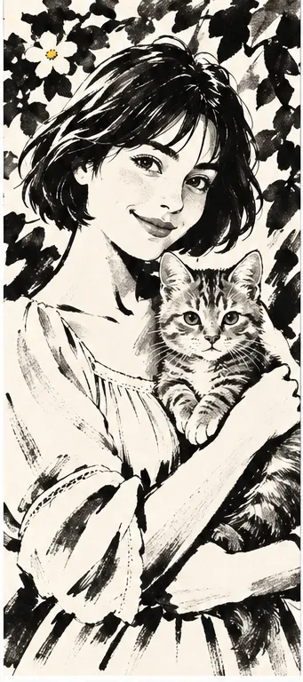
When color is not the important part of a memory, black brush-like marks and light paper can make its pose stand out. Open the Ink preset with a clear portrait or pet photograph. Our illustration shows broad black hair, interrupted clothing strokes and a lightly drawn face. It is an AI-made raster picture, not a hand-painted commission, editable pen paths or a certified example of a traditional painting school.
Style illustrations, not verified before-and-after outputs from the live tool. They show a visual direction; your photo may produce different colors, likeness and details.
Choose ink for dark shapes, not merely a black-and-white photo
Removing color from a photograph leaves photographic shading. The Ink direction instead reorganizes parts of the image into strokes, dark masses and open areas. In our reference, hair and flowers are bold while the face remains relatively light. Before generating, decide whether the pose will still read if some small detail disappears. Someone seeking a faint pencil study, exact tattoo stencil or cultural reproduction may need a different workflow. Judge visible marks rather than treating every monochrome result as the same medium.
Brush marks, graphite tones, or carved-looking lines?
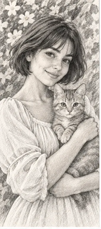
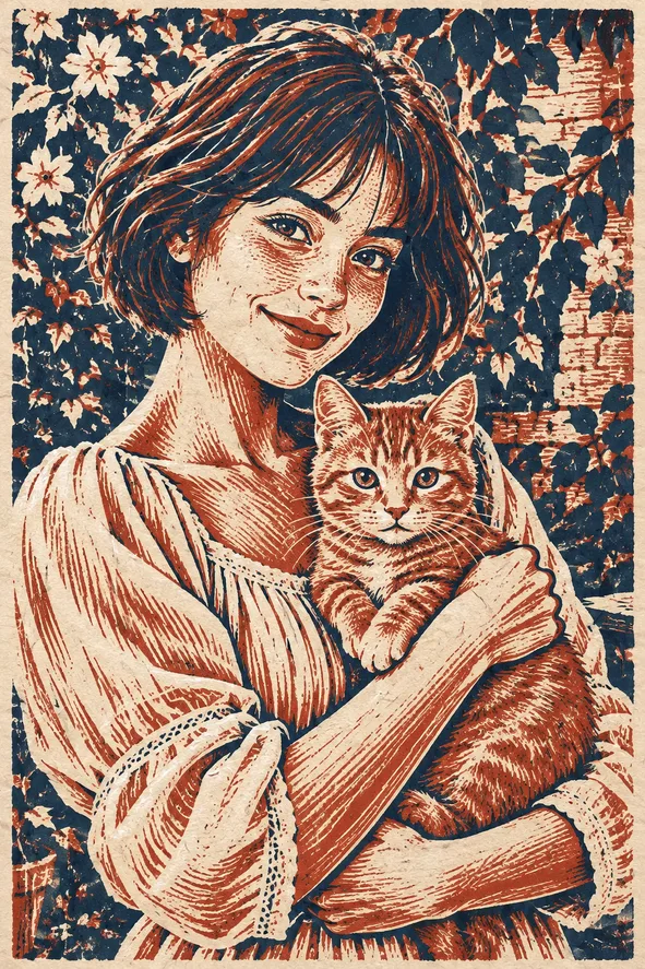
Our own references help distinguish three visual structures. They are not paid same-photo test results, and the downloaded picture is not a vector drawing.
Ink: broad dark marks and open spaces
Dark hair and flower silhouettes contrast with a pale face and paper-like background. Compare this for a graphic portrait whose gesture matters more than exact skin texture. Watch for an eye or pet marking swallowed by a dark shape. The preset does not let you choose individual brush pressure, ink density or a particular calligraphic stroke.
Fine graphite-like marks and gradual shading describe the portrait differently. Compare it when cheek volume and gentle detail matter more than large black forms. It still reinterprets the subject, but it does not need an ink-like mass to carry every shadow. Neither style supplies a step-by-step record of an artist drawing your portrait.
Repeated cut-looking lines and a restricted palette suggest a printed block. Choose this for a more patterned, textured keepsake rather than flowing brush gestures. Closely packed lines may merge at small sizes. The resulting still image is not a carving plan, a separated printing plate or an editable cutting file.
A useful ink interpretation starts with a readable relationship between light and dark.
Keep face and pose separated Use a picture where the chin, hair and clothing do not all disappear into the same deep shadow. A lighter area beside dark hair helps reveal the silhouette. For two subjects, preserve the contact between them: an arm around a pet should not become an unexplained black wedge. Cropping distracting background is useful, but leave the hands and ears needed to understand the pose.
Know which colored details will vanish A red collar against green leaves may be distinctive in the photograph but similar in tone once redrawn. Choose recognition cues that do not depend only on color, such as ear shape, an obvious marking or glasses. Exact fabric patterns and label text are poor priorities for a broad-brush result. Keep the photograph if those details are required for documentation or a product listing.
Review the places where ink becomes heavy
The empty areas are part of the design. Do not judge the output only by its dramatic dark texture.
Inspect eyes, muzzle and fingers Look inside the darkest regions for missing eyelids, merged fingers or a pet's nose joining the fur. A beautiful brush mark can cover an anatomical error. Compare familiar features with the source, then check the whole outline at avatar size. Reject results that no longer explain who or what is present rather than assuming every omission is artistically intentional.
Check paper against your destination The cream or white-looking area is part of the generated picture, not necessarily transparent. Do not expect it to disappear when pasted onto a colored card. Inspect the actual download before layout and print a small proof if needed. Place names and dates separately with accurate typography; asking the illustration to carry tiny lettering can introduce invented text.
Choose the right use for a brush-style image
A digital illustration can be a useful reference without being production-ready for every medium.
Personal stationery and visual studies Use a suitable result for a personal card, journal illustration or monochrome avatar after checking rights and recognition. Ask permission before making someone else's likeness public. Label the picture as stylized AI art where context could imply an actual commissioned painting. The page does not guarantee print dimensions, ink coverage or faithful reproduction of an artist's working method.
Not a stencil or traditional art certificate This is not automatically a safe tattoo stencil, embroidery pattern or laser-ready vector. Those uses require specialist checking of scale and paths. The reference also does not demonstrate historically authentic Chinese ink wash, Japanese sumi-e or another local tradition. If those techniques are your real task, consult relevant artists and judge their process rather than relying on a broad digital style label.
01Open Ink and upload a clear source The button preselects Ink. Choose a permitted image with enough contrast to explain the pose.
02Confirm style and current cost Check requested outputs and displayed credits in the workspace. There is no dedicated brush-pressure or ink-density control promised here.
03Review dark regions, then download Inspect recognition, anatomy and background. Save a suitable picture and add exact text or print layout separately.
Ink appearance is not an editable ink drawing
AI can simplify or invent facial features, markings, hands and lettering. The output is a raster still, not SVG pen paths, a stencil or an authenticated traditional painting. Paper-like areas may be opaque. Our references are owned illustrations, not verified customer outputs.
Use a photo you can share with the service
Upload only photos you may authorize the service to process, with permission from other people shown. Avoid sensitive documents. Generation sends the image for processing, not local-only editing. Finished work can be viewed and downloaded in My Creations; removing a completed record hides it from your user history but is not a promise of immediate erasure from administrative records, providers or backups. Read the privacy policy and contact [email protected] for a data-deletion request. Review images before sharing, especially when another person or a child appears.