Give your photo the light, layered feel of watercolor
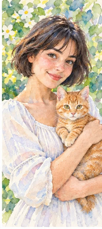
Start with a portrait, pet photo or travel memory you want to reinterpret—not a document you need to reproduce exactly. Watercolor is a good direction when you want translucent color, softened edges and a paper-like finish. See the illustrative comparison, then open the workspace with watercolor already selected for your own photo.
Style illustrations, not verified before-and-after outputs from the live tool. They show a visual direction; your photo may produce different colors, likeness and details.
Choose watercolor for color and atmosphere, not exact reproduction
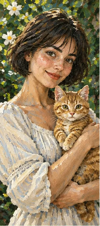
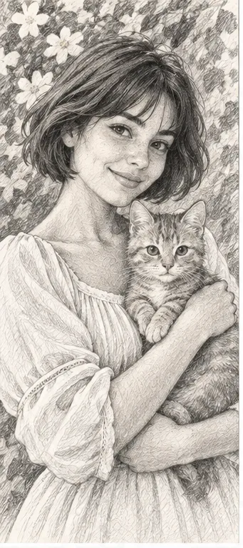
The useful question is what you want the photo to become. For a soft personal avatar or a keepsake with blended color, watercolor may fit. For weighty, textured brush marks, compare oil painting. For a monochrome drawing that emphasizes light and shadow, compare pencil. If a face, product label or architectural detail must stay exact, keep the original photograph: AI repainting can change those details even when the whole image looks attractive.
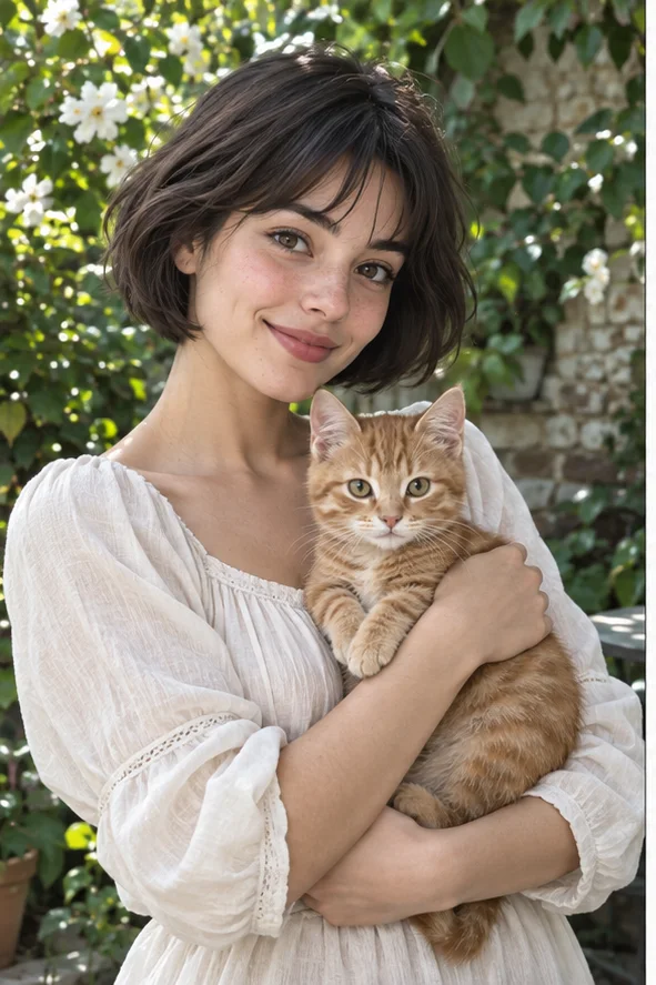
Same subject, three different treatments
Look at the skin, white sleeve, cat's fur and flowers—not just the overall color. These examples illustrate different marks and edges; they are not a quality ranking or a controlled generator test.
Watercolor: transparent washes
Pale areas suggest paper showing through, with color collecting around selected edges. The flowers and sleeve feel lighter than in the oil example. Choose this direction for a gentle illustration, while checking that softness has not erased eyes, pet markings or the main silhouette.
More substantial marks describe the blouse, foliage and face. Compare this when you prefer visible brushwork and a stronger painted surface. It can make a busy setting feel heavier, so do not choose it merely because it looks more detailed at thumbnail size.
Graphite-like shading replaces the original greens and oranges. This direction suits a drawn portrait or a light-and-shadow reference, not a colorful wash. Look for useful separation between the subject and background; too much gray can hide the expression you wanted to keep.
Clear focal points and readable light give the repainting a more useful starting point. A soft style does not mean a blurry source is suitable.
Portrait: keep the expression visible Use a face large enough to see the eyes and mouth. Avoid deep backlight, heavy beauty filters and hair covering key features. Leave room around the head so a later avatar crop does not cut through the face. Watercolor is decorative, not an identity-preserving headshot process.
Pet: show the markings that matter Choose a photo where ears, nose and distinctive fur patches can be seen separately from the background. A tightly curled pose or dark fur against a dark sofa makes the outline ambiguous. Check those markings after repainting, especially if the image is a personal gift.
Travel scene: separate the big shapes A sky, building or hillside with a clear focal point is easier to judge than dense crowds and signs. Decide which feature makes the memory meaningful. Small lettering and distant faces may be reinvented; watercolor should not be used as a faithful record of a place.
Sharing or printing: plan the crop Keep margins for a profile circle, card or frame and avoid placing the main subject against the edge. This flow produces a raster image, not a layered painting, editable vector or guaranteed print-size artwork. Review the downloaded dimensions and test a small print before ordering a large one.
01Open the preselected workspace Use the button to open photo filters with watercolor selected. Upload a JPG, PNG or WebP you are allowed to use. Start with one clear photo if you want an easy comparison with the original.
02Check the choice and credits Confirm the watercolor selection and the current total before submitting. Other styles or photos can change the total. This preset does not offer manual wetness, paper-grain or brush-intensity controls; choose another workflow if those adjustments are essential.
03Review the finished interpretation Compare the result with your source before downloading. Decide whether it keeps the important expression and composition, rather than expecting a pixel-for-pixel transformation. An attractive background should not distract you from a changed face or pet.
Four checks before calling it finished
Inspect the whole composition at normal size, then enlarge the areas you care about. A pleasing wash can conceal an incorrect detail.
Readable focal point Can you immediately find the face, pet or landmark? If similar colors blend the subject into the background, try a source with clearer separation rather than accepting softness everywhere.
Color without muddy patches Check skin, white clothing and the sky. Blended colors should still separate the main forms. An unintended dark patch over an eye or gray wash across a face is a reason to reject the result, not a necessary watercolor feature.
Important details intact Check eyes, fingers, paws, glasses, animal markings and any text. AI can invent or change them. For a keepsake, recognizability matters more than the amount of paper texture; for a product listing, do not present an altered illustration as an exact product photo.
Works at the destination Preview the actual crop and downloaded file where you will use it. Fine textures can disappear in a tiny avatar or look distracting when enlarged. Do not assume that a good screen preview guarantees the same color or sharpness on printed paper.
An AI illustration, not a commissioned painting
The watercolor preset reinterprets your image. It can change likeness, proportions, color, objects and background, and does not reproduce a human artist's physical pigment or paper. The examples do not measure live success rates. There is no guarantee of exact identity, editable brush layers, transparent backgrounds or production-ready print files in this flow. Keep a copy of the original and do not use this decorative result for official documents or factual evidence.
Use a photo you can share with the service
Obtain permission when another person appears in your source and avoid private documents or confidential scenes. Generation sends the upload for processing. Finished images are accessible in My Creations, where you can download or delete the record and associated files. Review the privacy policy for the service's handling of uploads; this page does not promise local-only processing or an unverified automatic deletion period.