Turn a favorite photo into bold acrylic-style illustration
Choose Acrylic when you want broad painted color, visible brush boundaries and a subject that feels illustrated rather than softly washed. Start with your own portrait, pet or simple composition. Open the photo-filter workspace with Acrylic selected, then check the actual selection and credit total before creating your version.
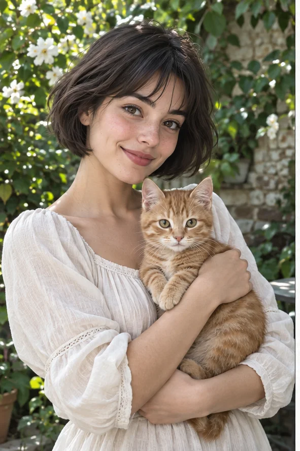
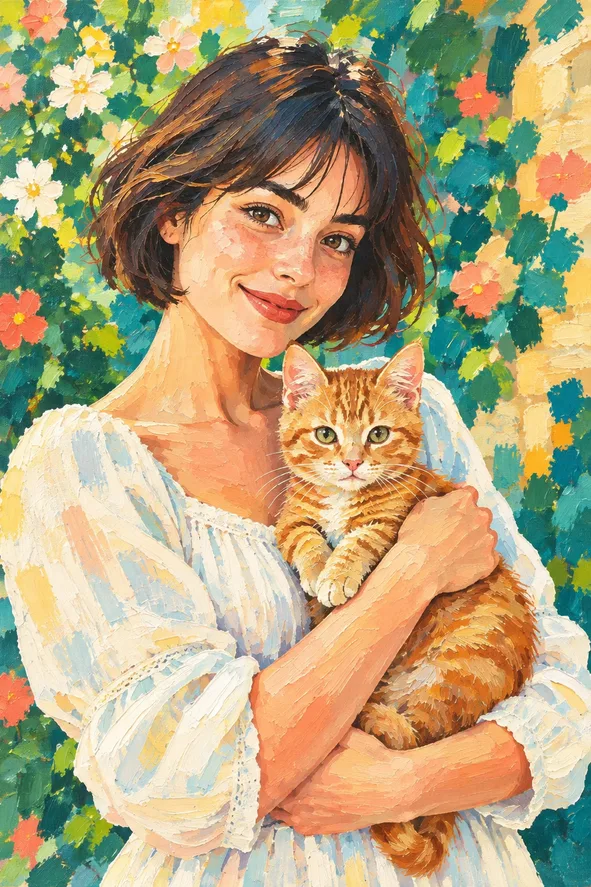
Style illustrations, not verified before-and-after outputs from the live tool. They show a visual direction; your photo may produce different colors, likeness and details.
Make the painted shapes the point
An acrylic look is useful when the important decision is how strongly the picture is organized into blocks of color. The example uses substantial painted areas around the face, cat and garden. It is not an oil-paint filter with a different label or a promise to simulate drying time, physical paint thickness or real canvas. Choose it for bold decorative artwork, not accurate documentation of a person's appearance or a product's material.
Acrylic, oil or watercolor?
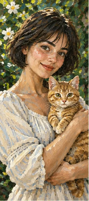
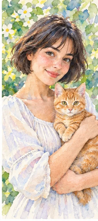
These owned illustrations show distinct visual directions on the same recognizable subject. They are editorial references, not competitor outputs or a controlled test of which filter preserves more detail.
Acrylic: opaque areas and firm brush edges
Look at the blocks of color around the orange cat and the green floral background. The broad shapes make the composition feel deliberately painted; a photograph's tiny tonal transitions matter less. Choose this direction for a lively personal poster or illustration where color structure carries the image. An appealing painted surface does not excuse a changed hand, misplaced eye or lost pet marking.
The oil example emphasizes a denser, layered treatment in hair, fur and surrounding flowers. It can fit a more traditional painted portrait when that surface is the desired feature. Digital presets are interpretations rather than measurements of actual media. Neither the Oil nor Acrylic choice lets you adjust a physical paint recipe or guarantees which one will retain the exact source expression.
Watercolor treats the setting with washes rather than the opaque planes shown in the acrylic example. Consider it for a gentler card illustration or airy surrounding decoration. A wash that looks transparent does not produce an automatically transparent PNG. The decision is the visual treatment of color and edges, not a ranking of the three styles or a claim about their printing quality.
Prepare a composition that survives simplification
Broad painted areas work best when the photograph already separates its important shapes.
Keep the subject distinct from its surroundings Use a clear photo in which the head, hands and any pet stand apart from the background. Similar colors touching each other can turn into one large painted area. In a person-and-cat portrait, preserve a readable boundary between the arm and animal. Leave room around ears and the top of the head; this preset is not a dedicated canvas-expansion tool and cannot promise to repair a missing part.
Choose a few important color relationships A bright subject against a quieter background gives the illustration a useful hierarchy. Avoid making small logos, printed labels or delicate jewelry the only identifying feature. Painted reinterpretation can simplify them. Do not upload an already heavily processed painting and expect a faithful material conversion. Keep the original photograph separately so you can distinguish deliberate color choices from accidental changes.
Match the illustration to the finished object
A digital artwork is one element of a poster or card, not the complete print-production workflow.
For a poster, reserve space for the message Choose a source with an uncluttered area if a title will sit beside the subject. Add lettering in a layout tool after generating the picture rather than trusting a painted sign to remain readable. Test the artwork at the intended display size: broad color areas should keep their shape and the face should still be identifiable. Do not confuse the on-screen example with guaranteed poster resolution.
For a pet keepsake, protect the identifying marks Coat patterns and ear shapes can matter more than photographic fur detail. Compare those features before you save a favorite. For printing, check the downloaded file's actual dimensions, crop and your printer's requirements. The filter does not supply a physical acrylic painting, editable brush layers, automatic bleed, a color-managed proof or commercial permission for an image you do not own.
Read painted edges before accepting the result
The shape of the color should support the subject, not hide a structural problem.
Inspect the boundaries that carry recognition Look where the face meets hair, fingers meet fur and the cat's ears meet the garden. A broad edge can be part of the acrylic appearance; an extra finger or an eye merged into the background is not simply texture. Compare at both normal size and a closer view. Attractive saturated colors are not evidence that every important feature from the photograph survived.
Choose another direction for a different goal If the image feels too solid and graphic for your purpose, use the available Watercolor or Oil direction rather than assuming a hidden opacity slider exists. If recognition is the issue, begin with a clearer source. Repeating a generation cannot guarantee a specific correction. Use genuine photographs where accurate identity, fine product detail or faithful colors are essential to the purpose.
01Select a clear, authorized source Keep the important person or pet large enough to recognize and leave the needed edges inside the frame. Obtain permission for private photographs of other people.
02Open Acrylic selected The creation link selects the active Acrylic illustration style. Confirm that choice and the total in the workspace. The current public catalog lists 2 credits per output; this is not unlimited free painting or a manual brush editor.
03Save the illustration, then design around it Compare the key shapes with the original before sharing. Add type and prepare any print layout separately, using the actual downloaded dimensions rather than a promised physical print size.
A painted interpretation, not a physical medium
AI can change facial features, anatomy, pet markings, objects and small text. Acrylic describes the picture's visual style, not a real painting service or guaranteed canvas texture. The output is not editable brush geometry or a print-ready proof. Check current credits, download conditions and the privacy policy, and retain the rights and consent needed for your source photograph.
Use a photo you can share with the service
Upload only photos you may authorize the service to process, with permission from other people shown. Avoid sensitive documents. Generation sends the image for processing, not local-only editing. Finished work can be viewed and downloaded in My Creations; removing a completed record hides it from your user history but is not a promise of immediate erasure from administrative records, providers or backups. Read the privacy policy and contact [email protected] for a data-deletion request. Review images before sharing, especially when another person or a child appears.