
AI image generator
Make a process easier to follow at a glance
Create my process visual ↗Start with a small set of steps you have already verified, then ask for an illustration panel, a short label and a clear reading direction for each one. An AI infographic can turn a compact explanation into a visual draft. It is an image-generation workflow, not a spreadsheet chart engine: you remain responsible for the meaning, order and evidence behind the information.
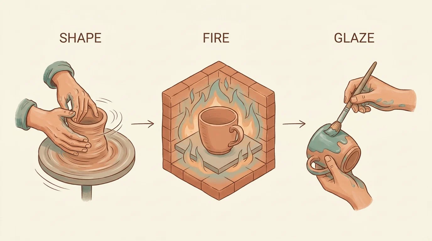
Choose a process infographic for a short sequence or a simple conceptual comparison. Choose a proper chart tool when the reader must inspect exact values, axes or a dataset. Our three-panel ceramic illustration shows a possible layout with labels and arrows; it is not a complete or technically verified pottery instruction. A useful visual starts with accurate source information, not a request for the model to invent facts.
From your idea to a finished image
Prepare
Write each step in plain language, verify its order and separate the illustration request from the factual statement. Keep a source note outside the image. Do not upload private data just to obtain a decorative chart.
Choose
The example opens Nano Banana Pro with a wide composition. Replace the illustrative ceramic subject with your verified process. Keep the labels short and the original demonstration words separate from your own factual content.
Create
Open the workspace, review the selected model, image settings and current credit estimate, then submit when ready. The link does not upload a sample or start a paid job. Each new generation is a separate request; an eligible failed task returns its charged credits. Keep the original files before experimenting.
An editable starting prompt
Create one horizontal 16:9 three-panel pottery illustration on ivory paper. Left: hands shaping clay on a wheel; middle: unglazed cup in a kiln; right: hand brushing glaze on a cup. Muted teal and clay palette, fine isometric drawing, generous margins. Exactly SHAPE, FIRE, GLAZE above the respective panels. Thin arrows left to right, no other text or logos.
Decide what the reader needs to understand
An infographic should make one relationship easier to see. That might be a sequence of actions, a contrast between two choices or the parts of an object. A long report is not automatically improved by shrinking it into a single picture. Identify the question the visual answers and remove details that do not support it. For a process, decide where the reader starts and what completion looks like. For a comparison, define the same criteria on both sides. The generated image cannot decide which information is true or important on your behalf; make those editorial decisions before writing the art direction.
Give every panel a distinct visual job
A short sequence works when each panel contains one action and the illustrations are visibly different. Specify the object, action and label for each stage rather than asking for an infographic about a broad topic. Arrows should indicate a reading direction, not create an accidental loop. In the example, shaping, a kiln and a glazing brush make the panels visually distinct. That clarity is a layout observation, not verification of the entire craft process. If your real sequence has prerequisites, exceptions or repeat stages, include them in the verified outline before simplifying the visual. Omitted steps can change the meaning.
Separate factual content from image styling
Keep the checked outline in a document where it remains editable. Then add palette, line style, margins and illustration directions to the prompt. A warm clay palette may suit a craft visual; a neutral technical palette may suit an operational explanation. Neither style establishes authority. Do not ask a visual model to fabricate statistics, citations, clinical instructions or safety procedures. An attractive chart with invented percentages is still wrong. If values are essential, use a data-aware workflow with reproducible calculations and bring the finished artwork in only as a supporting element. This page does not provide spreadsheet import or automatic fact checking.
Make labels brief and readable
Use short action words or nouns so the illustration carries the explanation. The sample's English labels are visible in this specific output, but there is no multilingual typography benchmark behind it. Put longer explanations in the surrounding webpage or presentation. Check contrast, line weight and spacing at the intended display size. A label that is readable when zoomed in can disappear on a small slide or phone. Dense legends and footnotes need a controlled text layout rather than a generative image. Do not mistake an image containing text for an editable document in which each word can be corrected independently.
Deliver a visual explanation with a source trail
Save the verified outline, original prompt and accepted image together. If someone questions a step or changes a number, update the source first and then revise the illustration. Generated arrows, symbols and repeated objects can suggest a relationship you did not intend; inspect the meaning as well as the appearance. The downloaded result is a raster image, not a guaranteed vector diagram, accessible data table or complete operating manual. Add appropriate text outside the image so people can understand the information without relying on visual interpretation alone. The tool is useful for exploring a clear layout, not for outsourcing factual responsibility.
What this workflow does and does not deliver
- Confirm the reading order and every label against a verified outline.
- Do not treat illustrated numbers or craft stages as independently verified facts.
- Keep an editable text explanation beside the final raster image.
Editorial method: task-specific guidance checked against the current workspace and site-owned model examples. Examples were generated on October 7, 2026, at the 1K setting; they are not customer testimonials, competitor results or proof of universal performance.
Reviewed October 13, 2026
Privacy and image deletion ↗