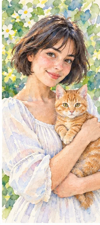
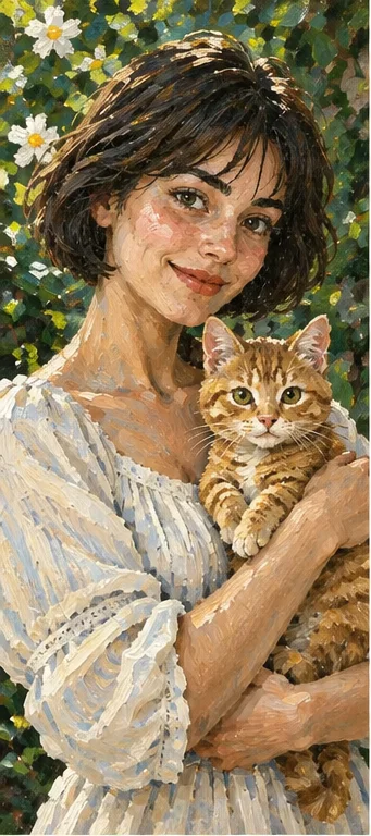
Watercolor leaves a lighter, airy impression; oil builds weight through layered color. Compare how each treats the face and shadows, not only how attractive the texture looks.
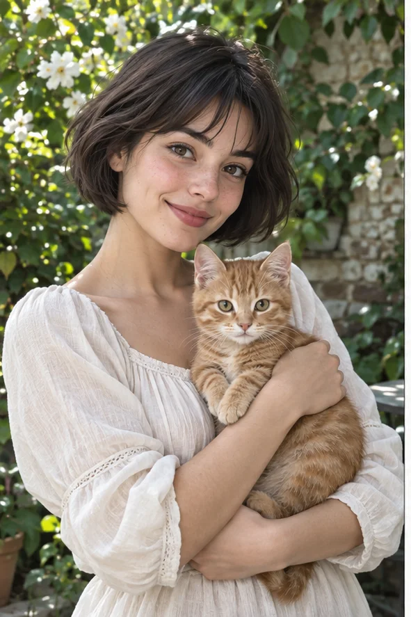
Reference imagePortrait with visible hair and shoulders
Why consider this directionUse the reference to separate a style’s changes from the pose, lighting and objects already present in the photograph.
Check before choosingCompare recognizable cues before judging the new texture. A pleasing transformation can still lose the subject’s defining features.
02
Compare the visual trade-off
Try the same source in both styles. Choose watercolor for open light areas, or oil when strong tonal modeling is central to the portrait.
IN PRACTICE
Work through a practical example
01
Choose the next move
Choose watercolor when light and open space carry the mood; choose oil when stronger tonal mass supports the portrait. Keep the destination’s scale in the decision.
02
Have these ready
Use the same photograph for both styles and prepare the intended wall or card mock-up.
03
Make the first version
Generate one watercolor and one oil direction, then compare face recognition before texture. Place both in the mock-up at the same size. Look at how soft washes or denser strokes behave around eyes, hair and background, rather than comparing color saturation alone.
Try this before committing
Compare the cheek shadow and background foliage in the two examples. Watercolor favors light gaps and washes; oil emphasizes connected masses of color. Use the same source when testing, so a different crop does not bias the choice.
The output is a digital interpretation of a medium. Paper, canvas and printing affect the final object separately. If the work is a gift, inspect a small printed proof and describe it as a digital artwork rather than implying hand painting.