Have these ready
Use the actual show name and the platform’s current square-cover requirements. Decide whether a person or symbol carries recognition.

Design and illustration
Build the cover around one visual idea and a short readable title. Details that only work full-screen will disappear in listening apps.
You choose your own source and review the current cost before generation.
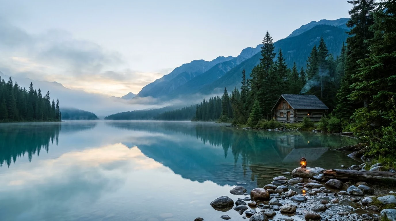
Generate the illustration or background first, then typeset the actual show name. Keep important content away from the outer edge and test the platform’s current crop.
Place the cover beside three other small covers. If its identity depends on tiny text, simplify the symbol or shorten the title.
Open my creative starting point ↗Use the actual show name and the platform’s current square-cover requirements. Decide whether a person or symbol carries recognition.
Create one art direction with space for the title, then typeset the name separately. Test it as a tiny player tile among other shows. Check that the title remains distinct and that any face still looks recognizable; fine decorative scenery rarely survives that view.
A stable main cover identifies the show; episode art can vary around it. Keep this distinction before generating many cover variants.
Why consider this directionThe imagined landscape provides broad shapes and open areas for considering a cover, banner or background composition.
Check before choosingPlace the actual text over the image and test alternative crops. It is an illustration, not evidence of a real destination or geography.

Why consider this directionThe travel-style composition can suggest an editorial atmosphere and a focal region beside a heading.
Check before choosingVerify any detail your caption treats as a real place. Attractive scenery can combine invented landmarks and should not define factual travel guidance.
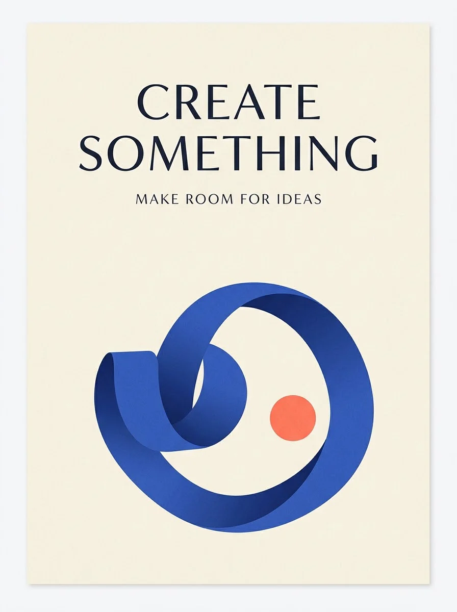
Why consider this directionThe graphic example helps you judge the balance between display lettering, supporting shapes and open space.
Check before choosingCheck the smallest lines and any numbers. A hierarchy that works in the example may need a different layout for your longer title.
Use the publishing platform’s actual roles for show and episode artwork. Keep frequently changing details in editable fields or episode assets where appropriate. Regenerating the main identity for every number can make the show harder to recognize.
Content reviewed: