Have these ready
Choose a product master and collect the colors already used in your storefront. Include the actual page background.

Product visual briefs
Use the product's existing color as the anchor. A complementary backdrop can create separation, but colored light may make the material appear different from the item a buyer receives.
You choose your own source and review the current cost before generation.
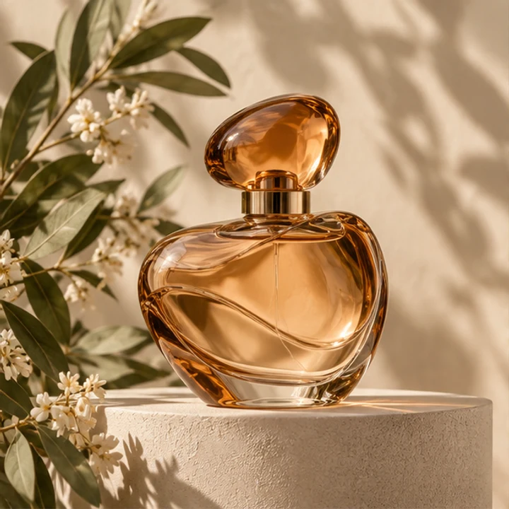
Keep a neutral reference beside the new image. Compare the product itself, not just whether the overall palette looks harmonious.
Try a neutral background and one muted complementary hue. Compare the product color against the original on a neutral screen. Background contrast should separate the item without making its material appear warmer or cooler than it really is.
Open my creative starting point ↗Choose a product master and collect the colors already used in your storefront. Include the actual page background.
Try one neutral and one brand-color direction with the same item. Compare the edge contrast and any color cast on reflective packaging. Place the candidates beside the page’s price and button; the background should support the product rather than become a separate campaign message.
Use a calm palette for many different products. A stronger complementary color can highlight one launch, but check the actual package color remains accurate.
Why consider this directionA simple bottle reference helps separate product identity from new decisions about the surrounding scene.
Check before choosingCompare silhouette, cap and base before decorative light. This example is not evidence of your own SKU or packaging accuracy.
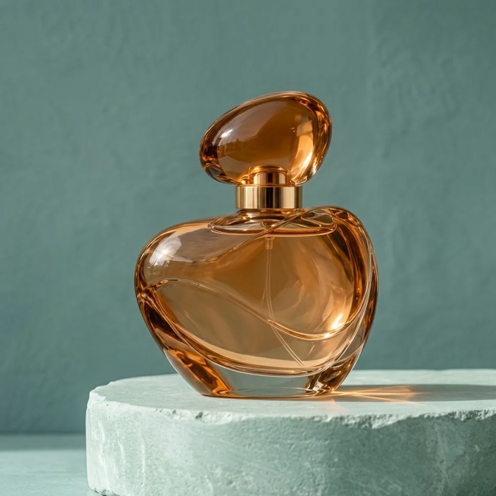
Why consider this directionThe styled product scene can help you consider a supporting surface, negative space and a restrained lighting direction.
Check before choosingCheck contact and the object’s shape separately from the setting. An earlier example does not establish a general quality ranking between models.
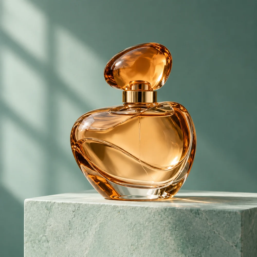
Why consider this directionA different product-art direction offers another way to evaluate light, display structure and the space around an object.
Check before choosingInspect the cap, edges and supporting surface. Do not assume different example images used identical prompts or prove the same product was preserved.
Yes, surrounding color and generated reflections can shift the impression. Compare the item against the real photograph in neutral viewing conditions. If a hue is important to the purchase, provide an accurate product reference instead of relying only on a styled scene.
Content reviewed: