Have these ready
Write one offer, the venue and the date as verified text. Sketch their order before making background art.

Design and illustration
Give the poster one main message and one focal object. Keep the menu, address and fine print for a separate layout step rather than crowding the generated image.
You choose your own source and review the current cost before generation.
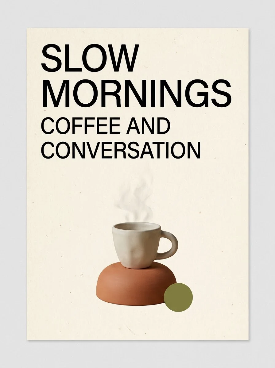
The example's English text is part of the sample, not proof of accuracy in every language. Check each letter before sharing.
Write the essential message in one line before choosing imagery. Test whether the drink, headline and date remain readable from a few steps away. Keep prices and opening hours editable so a later change does not require rebuilding the entire artwork.
Open my creative starting point ↗Write one offer, the venue and the date as verified text. Sketch their order before making background art.
Start from the cafe-poster direction but keep final text for a layout editor. Place the longest headline over the generated art and test it at phone size. Check whether cups, decorative marks or background contrast make the offer harder to understand.
Use one dominant image if the message is short. If prices, dates and multiple items fill the page, simplify the art and give typography more space.
Why consider this directionThis English-lettered poster example lets you examine how a main headline and visual motif share the page.
Check before choosingRead every visible line rather than accepting the poster’s overall polish. Exact local-language typography needs its own verified layout.
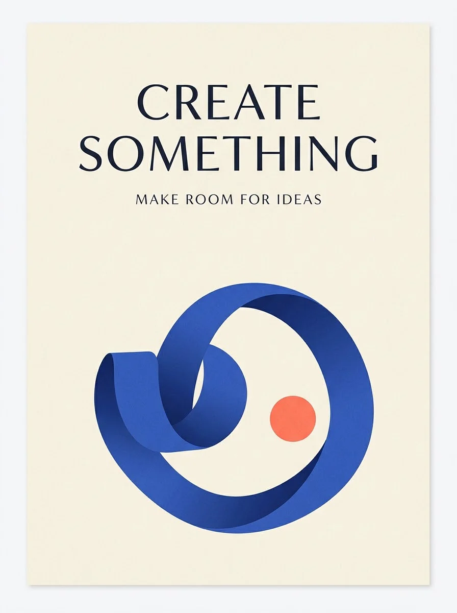
Why consider this directionThe graphic example helps you judge the balance between display lettering, supporting shapes and open space.
Check before choosingCheck the smallest lines and any numbers. A hierarchy that works in the example may need a different layout for your longer title.
No factual field should be accepted without checking. Add the venue’s current hours and terms from your own verified copy. Proof the final export, including small lines that may be less noticeable than the main heading.
Content reviewed: